 I often use a variety of paper networking mapping exercises in my face to face workshops. These have been valuable because the maps help people visualize their work networks in new ways, and the conversation around the maps — especially getting others’ perspectives — helps us see our own maps in new ways and then be more strategic in the use of our networks.
In an upcoming online workshop on knowledge sharing for the CGIAR, we want to do this exercise online — and we want to keep technology low key as this is at the start of the workshop and some participants are not as techy as some of us! 😉 So I’m trying to figure out how to do it. I really like the Net-Map process, but it is more in depth than we want to go for this introductory activity.
Would you help me and try it out? I’ve altered the instructions here so we can do it right in the blog, but it will actually be done inside a Moodle installation.
Activity: Map Your Network
Brief Description:
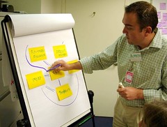
This activity offers and introduction to social network mapping. Using paper, pens and post-it notes, you can create an informal map for your network and then discuss it with others in and outside of your network. Discussing with your network partners offers their perspective of how they fit into your network, which you may not always easily see. Discussing with workshop participants gives you a chance to see the diagram from another’s point of view. Together, these help inform your strategy for working with and sharing knowledge with those in your network.
Purpose:
- Understand a simple application of social network mapping
- Consider how best to utilize your network for your project
- Use the multiple perspectives of others to improve your understanding of your network
Materials:
- 2-3 pieces of flip chart paper
- Small Post-It notes (or pieces of paper and tape)
- Pencil
- Marker pens (2-3 colors)
- Digital camera
Steps:
1. Think of a project that you are working on that requires knowledge sharing. Ideally, this is a real project and one you will be working on throughout the workshop. (For our test, pick one of your networks!)
2. List all the people and organizations involved with your project, putting each one on a small Post-It note. We’ll call these “notes” from now on.
3. Create a note that represents you or your immediate working group or organization.
4. Starting with your note, arrange the notes on the flip chart paper. Place the other notes in relationship to you and your organization. In other words, people or organizations you most frequently do things with should be closer to your note than ones you only interact with infrequently. If your work is all internal, consider other departments, etc.
5. If people or organizations on the notes have relationships or interactions with each other, try and place those notes closer to each other. Move the notes around until you have a general sense of how each person/organization relates to you and to the other notes.
6. Now with a pencil, draw an arrow from you to any of the other people/organizations to whom you regularly share knowledge. The direction of the arrow should be from your note to their note. Then draw lines from other people/organizations who regularly give you information or share knowledge (or you WISH they would!). This time the direction of the arrows should be from them to you. Finally, repeat this process for where other people/organizations share knowledge with any of the other people/organizations. You should now have a set of penciled, directional lines.
7. Now, look at the network again. After thinking about the knowledge flows, do you want to reorganize the notes in any new arrangement? Is there a clumping of some people/organizations? Are some with few or no pencil lines and should be moved further away from your note? Go ahead and move them.
8. With your rearranged notes, draw in the knowledge sharing flow lines in pen. Put the flow from you to others in one color, and from others to you in a second color. Add a third, dotted line between any post its where there are the strongest connections. These identify primary connections in the network.
9. Take a moment to step back and look at your map. What do you notice?
a. With whom do you have the strongest knowledge sharing connections (two way arrows and dotted lines)?
b. With whom do you THINK you should have the strongest connections? If they are not the same as (a) what might you do to strengthen them?
c. Who is an important knowledge intermediary or connector in your network? These would be people/organizations who have lots of connections with other nodes. Which have very few connections and what are the implications for your work?
d. What might you do to strengthen weak connections? To manage where you have too many connections? If you are the only current ‘connector’ who else might help play that role?
10. If you have time, show your map to someone in your network and see what they see when they look at it. Make a note of their observations and any changes they might suggest.
11. Take a digital picture of your network image. Post it on Flickr or some other website and post a link in a comment to this blog post. Share anything you learned in your observations from steps #9 and #10.
12. Look at the maps of others, their observations and give your perspective on at least one other person’s map. A workshop facilitator will also offer their observations, so everyone will get some feedback.
13. After you have received feedback, post a short reflection in your Learning Log on the Moodle site about any insights you had about your network and how you can best use it for your work. (FEEL FREE TO DO THAT HERE IN ANOTHER COMMENT).
DEEP appreciation and thanks in advance for playing along.
Edited later: I have made a few tweaks, fixed some typos, all with the help of my friends. Photos of Twitter friends’ feedback via Flickr here. See also some early thoughts here.
Edited even later: Here is a Short Podcast with Patti Anklam on “Why Map our Networks?”
Hi Nancy, I think this is a a useful exercise and allows the learner to really think about social networking from their own perspective. Love the idea of taking a photo of the map and posting it up for discussion. Of course there are lots of mind-mapping tools around such as CMaps where I’ve done something similar however I agree that taking the ‘low-tech’ approach with newbies is a good thing as it makes them think about the topic rather than worrying about the technology.
Well done!
Marlene
From my twitterverse, Michael Guhlin has assembled some options for doing this with an online tool. http://www.edsupport.cc/mguhlin/archives/2008/03/entry_6775.htm
Thanks! And thanks to all the twitters/Skypers who gave feedback. I’ll post a summary in a day.
Dear Nancy,
I’m really curious to see how it goes. In our Net-Map activities we always found that building influence towers (answering the question: How influential are these actors?) and noting down the goals of actors next to the actor cards add a lot of additional understanding and very often are the real eye-openers when looking at situations that somehow don’t go the way you would hope them to go.
A lot of the CGIAR research aims at impacting on policy making and governance processes and adding the dimensions of power and interests may make it easier for the researchers to keep the political dimension of their work in mind.
Eva, how DELIGHTFUL to find your response. The Net-Map piece is really fantastic and I plan to try it at my next F2F. It really resonates with the experiences I’ve had so far, and yes yes yes, the power issues are often at the heart of the conversations that are generated.
I am HOPING that participants in this workshop – which IS a CGIAR online workshop!- get fired up enough to go the next step to the Net-Map method. We also have a short podcast from Patti Anklam on why visualizing our networks is so powerful. I’ll go ahead and attach that to the original post in case you or anyone wishes to hear it!
Hi Nancy, sounds like a great exercise, and the idea of people drawing something and posting the picture on the platform is exciting me. Hope it works (I’m always scared to give people too many steps to take) but I might try this too!
My experience with network mapping is with the Venn diagrams of Participatory Rapid Appraisals. I’ve done it quite often with farmers. In the Venn diagram you use circles representing organizations, they overlap when they work together. The more important an organization (in the perception of the mappers!) the bigger the circle. Great way of getting a discussion an why an organization is important or not (for us kind of evaluating the importance of organizations to the farmers).
Nancy –
How do you think about working with people who don’t naturally think in networks, but who always view the world through the lens of a spreadsheet? That’s a question I find myself asking over and over again and don’t have a good conceptual flipping-point to go to to get people to see a perspective that I take for granted.
Ed
Hm, really good question, Ed. It might be fun to flip a chart into a spread sheet and vica versa. Notice what translates and what doesn’t. Compare the perspectives of the one who started in map with the one who started in spread sheet. What might we discover?
Joitske, do you have some examples of the Venn Diagram maps on your blog?