Last week I was in Durban, South Africa, for the IST-Africa conference where Tony Carr, Maike Schansker and I ran a workshop on professional development in the networked/Web 2.0 era on behalf of UN University. One of the things Maike and I did during the second day was take graphic notes of the presentations.
The Purpose
We did visual capture for a number of reasons.
- First, from an academic conference perspective, note that there were 90 minute sessions with 5-7 papers presented each session in dark rooms with lots of (mostly) traditional PowerPoint. In a context of learning, the track we were following, it is interesting to see us yet again do what we tell teachers not to do. 😉 We wanted some form of participation for ourselves, beyond sitting and listening. (There was very limited opportunities for questions and dialog.)
- Second, we are both nurturing our graphic facilitating and recording practices, and in fact are part of a graphico’s community of practice! Maike was also practicing recording on her new electronic tablet.
- Third, the visual recording helps me listen better, and to focus. (I have difficulty with this!)
- Finally, the practice provides a way to share some of what we learned out to the world. It is a form of social reporting. We can share what we learned both with our own internal communities and (via things like Flickr) to the wider network.
I brought the sketches home, scanned them and uploaded them to Flickr, tagged them so I could group them together, and linked to our workshop’s wiki page (more on that in a subsequent post). Then I promptly forgot about them and moved on to the rest of my “been on travel” backlog.
Yesterday Stephen Downes picked up the photos and commented on them in his fabulous and widely read OLDaily. Hm… someone noticed! That is always interesting so I figured I should blog about the work and respond to some questions and comments I’ve gotten since Stephen’s post.
The Images…
…and a little self critique. I’ve embedded them below, but it is much easier to see if you click into Flickr itself! The drawing on pad on one’s lap leads to smaller, more detailed images than the large scale “drawing on walls” produces.
You will notice the different sketching styles of Maike and I, and the volume differences. Some presentations were jam packed. Some left us wondering what the key points were. I actually have three other pages with titles and the rest blank since I either could not follow, concentrate or I just “didn’t get it!”
As we looked at our pictures, we both noted we struggled to use more images and less words, and that for me, particularly, my images often got over-crowded. We were going so fast that most of the coloring work was during breaks or afterward. The presentations were so time limited that people talked fast and tried to pack a LOT into their 10 minutes. 😉
The Method
Here are my materials:
- Nice, smooth and fairly heavy paper, left on the pad as a hard writing surface
- Colored pens, Staedtler triplus(r) fineliner pens, 10 color set. Nice firm tips, fine lines and plenty of ink
- A small 12-color set of chalk pastels, Prismacolor Nupastel firm pastel color sticks. These are smaller and a bit harder than the low-cost chalk I use on my big, wall sized drawings. They give me a bit more fine control and I like the colors! Downside is they break easy so I try and pack them deep in my clothes in my suitcase!
- An old, grotty eraser.
Maike was using a new portable tablet PC and I’ll need to get the tech information from her if any of you are interested. We have been having some interesting conversations about both the tech and practice of electronic graphic recording.
Early on I decided on a “flow” template with the presentation title and presenter name in the upper left and cascading the notes to and fro down the page with arrows (later colored orange) as the connecting bits. When I did the finishing touches later, I chose a fairly limited palette and used little “cloud thingies” to highlight key topics. You will also see that some images also used some mind-mapping techniques.
The Comments and Observations of Others
Stephen Downes wrote:
These graphic lecture captures are invaluable teaching aids. Not simply because they represent the content of the lecture in an accessible format. But also because they make clear the structure of the presentation, a structure that should be very familiar to people who heard about the ‘the rule of threes’ I talked about in Argentina. Look at this one, for example. You can see the author employing some techniques – a pyramid, a four square diagram – to construct the overall presentation. Nancy White, Flickr, May 26, 2010 5:40 a.m.. [Link] [Tags: Accessibility, Africa, Flickr]
Wow, I never thought of the images this way. This is why we don’t work alone! I do want to be clear that some of the images, such as the one’s Stephen notes, are just my sketches of what the presenters had on their slides – so they get full credit AND I recognize that their device was useful to me as the listener. So great observation, Stephen, which you helped me see.
Emma Duke-Williams wrote:
But what fabulous diagrams, Nancy! I see they’re ‘public’, so I’ve passed them (& this page) on to some of our Study Skills folks – to see if they can use them to inspire students.
(I’m also wondering about the possibilities of creating something like that on a tablet, rather than having to remember the pencil case – and all the colours in it!)
Yes, Emma, they ARE public and that is an important part of our practice. A UN Agency funded my presence and participate, so in my eyes, what we learn, reify and produce goes back out to the world which funds the UN! But more fundamentally, it is a waste of resources and unsustainable to think that the benefits of conference participation in topics that are in the global public good are limited only to the privileged who can be face to face.
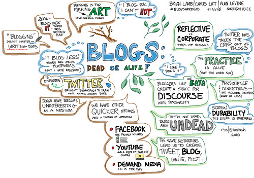
And yes, we can do this electronically. See these visual captures from Rachel Smith and Rob Cottingham (more) at Northern Voice earlier this month! I’m embedding one as an example from Rachel’s Northern Voice set on Flickr. I try not to rush out and buy new electronic toys, but after playing with Rachel’s iPad, I’m VERY tempted. It was easier than Maike’s tablet PC. 😉
So that is, as they say, the story as I know it! I’ll encourage Maike to chime in!