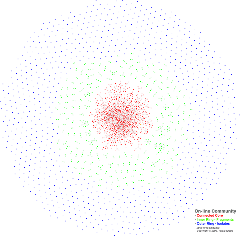
Valdis Kreb's image of emergent online community
emergent_community2.png (PNG Image, 778x766 pixels) - Scaled (97%)
Looking at this wonderful image, I am thinking about where we stop talking about community and talk about networks. I know this falls into the definitional traps about what is or isn't a community, but I think this is important online. This is where the F2F and online definitions can't quite mean the same thing.
Does the possibility of interaction with another constitute community? Or is it the ongoing, intentional interaction over time? I think it is the latter.Tags:
posted by Nancy White at 9:00 AM
![]()
![]()

4 Comments:
This image by Valdis speaks volumes. It would make a cool poster for explaining the 1/10/100 rule that runs through participation in social networks.
Hey, you! Are you a blue dot or a red?
It would be cool if it could be a movie of the network over time, because I think many of us move in our position in a community, between the core and periphery - for a variety of reasons. I don't think you are locked into being a blue dot or a red dot!
Nancy, thanks for posting this.
A few things about the diagram...
1) it is not a snapshot from one day... it shows the accumulated relationships at the time. This community has been active for years.
2) Two people are linked iff they have interacted on the site either by email, chat, or visiting one another's web page. The more interaction[over time] the thicker the link. We do not know of their off-site behavior.
3) A daily snapshot would show much movement from one part of the cluster to the other -- but what would that show? Maybe a bar chart of daily activity is just as good -- and much simpler?
4) 40% of this on-line community are lurkers -- blue nodes. This is a invitation only comuunity -- only people of a particular affiliation can join. I imagine that easy-to-join communities, like Yahoo or Google Groups have a higher % of lurkers.
5) We are tracking this group over time -- taking regular snapshots of growth. We have the ability to filter the links we show and we are constantly adjusting the cutoffs.
6) Most social network analysis focuses only on the connected population -- red nodes. The larger system that the network is embedded in is often ignored [usually because the data is impossible to gather]. This map shows the current relationships and some insight into the potential for future relationships and patterns.
I'm catching up on my delinquent response to blog comments, and Valdis, I wanted to circle back because I appreciated your thoughtful reply.
First, it is great that the links came from a variety of possible interactions. Did you note any differences between the modalities? One thing I always wonder about visualizing is our "back channel" communications in a community.
The question about the daily snapshot is good. I am not clear myself. I just wondered if there were patterns of change over time. So I'm trying to visualize how that would show up in a bar chart. My brain is not doing a good job. Nonetheless, it is great you are tracking the community over time.
Thanks again
Post a Comment
Links to this post:
Create a Link
<< Home